
C A R M A X
Search
A look back into continual customer discovery and how small progressive product updates increase sales and improve customer experience over years.


Not your average case study.
There's an ancient thought experiment about Theseus and his ship. After sailing around the world, the ship was preserved as a memorial. As the wood deteriorated, each worn-out plank was replaced. Eventually, every single piece had been swapped out. This begs the question: Is it still the same ship?
After years working on CarMax's search page, I found myself asking this same question. The page you see today looks different, behaves differently, and serves customers better than it did years ago. Yet it happened so gradually—one small experiment at a time—that you'd be hard-pressed to point to the moment it became "new."
This isn't a redesign story. This is a story about patient, iterative product work. About building trust with customers plank by plank, test by test, insight by insight.
Before & After

June 2019

September 2023
The Foundation
CarMax's search page is the entry point for inventory exploration across a nationwide network of used cars. It's where customers apply filters, sort options, and begin the journey toward finding their next vehicle. For some, that means confidently hunting down a specific make and model. For others, it's a bewildering first step into the overwhelming world of car buying.
Our team was called "Search & Rescue"—our mission was to help customers search for cars and rescue them from dead ends. We operated as a long-term, sustaining product team aligned to a domain rather than a single project. Our structure was classic: Product Manager, several front and backend engineers, QE, an analyst, and me as the sole designer.
We used dual-track agile and scrum processes to balance discovery and delivery. Our north star was building experiences that were valuable to customers, usable and feasible to implement, and viable for the business. Unlike initiative-based teams that spin up, ship something, and disband, we were in it for the long haul.

The Research Rhythm

The work had a heartbeat: weekly customer interviews, weekly analytics reviews, weekly "FullStory & Chill" sessions where the entire team watched session replays together.
We used Ethnio to ping customers in the middle of their shopping journey—catching them in the moment, not weeks later when their memory had faded. We tracked clicks and behavior through Adobe Analytics. We collected hundreds of pieces of website feedback. We maintained a living Miro board of customer desires and an ever-changing Opportunity Solution Tree to prioritize what mattered most.
The surprising finding that shaped everything: we were designing for two completely different audiences simultaneously. On one end, confident "car guys" who knew exactly what they wanted—down to the trim level and feature packages. On the other end, novice consumers who didn't know the names of car models or what features even existed. Budget-conscious shoppers who needed to stay within strict financing terms added another layer of complexity.
Oh, and then there was Google. SEO wasn't just a stakeholder—it was the stakeholder in many ways. We constantly balanced customer needs against how we ranked in search, making unique accommodations for bots without getting in the way of humans. It was a delicate dance.
Small Moves, Tested Religiously
Here's what made this work different: we broke everything into tiny experiments. No massive redesigns. No "big reveal" moments. Just small, testable hypotheses validated through qual and quant data.
The search bar language change seemed trivial on the surface. We switched the placeholder text from "Search by make, model, or keyword" to simply "Search CarMax." Removed search suggestions entirely. The result? A 5% increase in search bar interactions and a 20% jump in free text searches. We also discovered that 4% of searches were for things that weren't make or model—people were searching for features, colors, feelings.
The nationwide default experiment took months of careful testing. Historically, we defaulted customers to a 250-mile radius around their zip code. But what if we showed them everything nationwide (while hiding non-transferable vehicles)? The internal resistance was significant. Leadership worried about overwhelming customers, about shipping logistics, about setting unrealistic expectations.
We tested 25/25/25/25 traffic splits with several variants. The winning approach? Nationwide with hidden non-transferables. Customers saw 75% more cars. Zero search results dropped by 44%. Exit rates on search fell by 4%. Car page visits increased by 3%. The annual incremental profit? $9.2 million.
The real insight: showing customers more options let them self-select to a shopping radius they were comfortable with. It meant that when we later analyzed behavior, we knew their radius was a choice, not a default we'd imposed. That's powerful data.
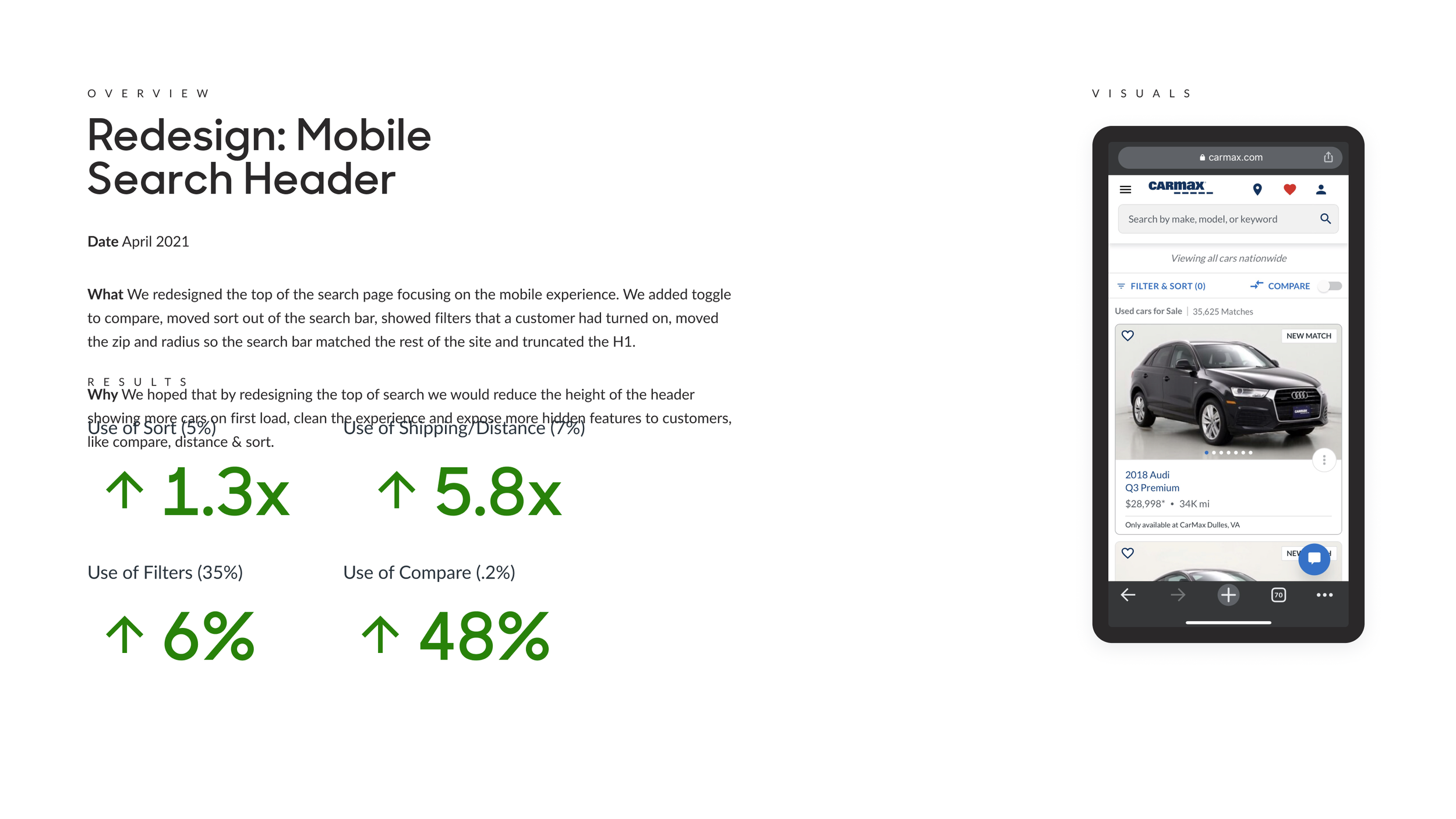
The mobile header redesign exemplified our approach to iteration. We redesigned the top of the search page, focusing on mobile first. Added a compare toggle. Moved sort out of the search bar. Showed active filters as pills. Moved zip and radius controls to match the rest of the site. Truncated the H1 to reduce header height and show more cars on first load.
The results told the story: sort usage increased 1.3x, distance/shipping usage jumped 5.8x, filter usage rose 6%, and compare usage—previously a hidden feature—shot up 48%. We'd exposed tools customers didn't even know existed.
The Experiments that Changed Everything
-
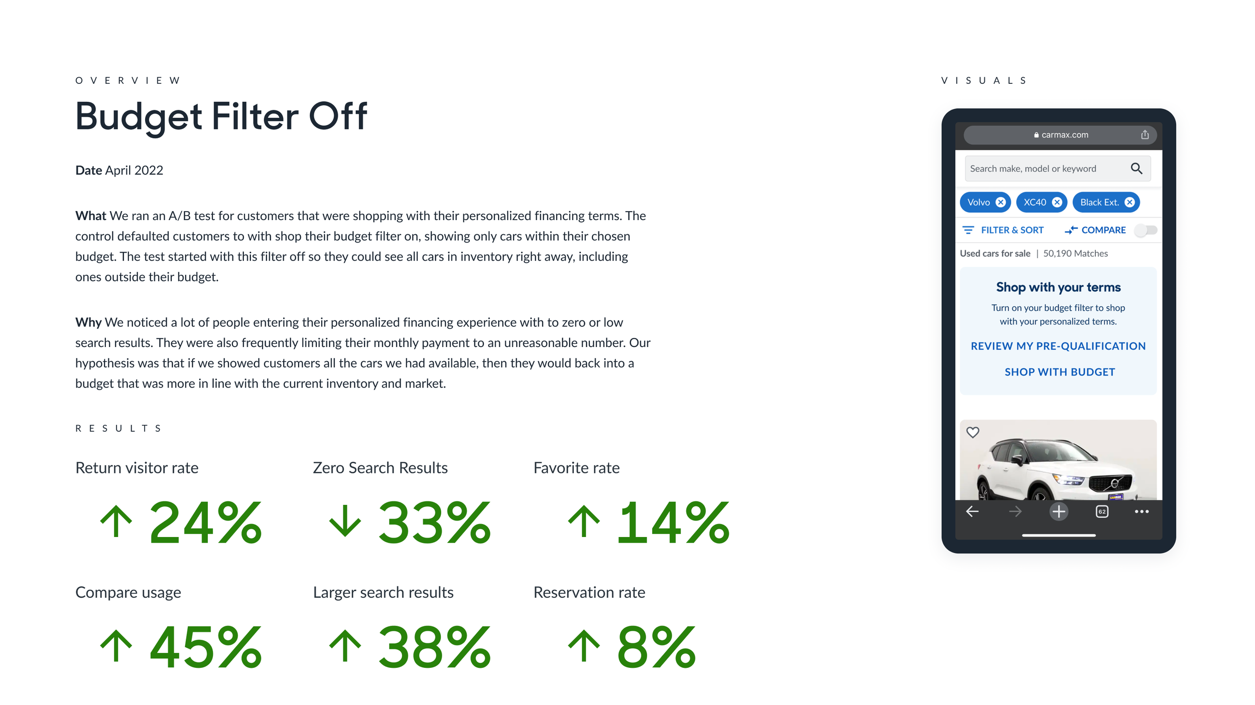
For customers shopping with personalized financing terms, we started with their budget filter off instead of on. We noticed too many people entering with zero or low search results because they'd limited their monthly payment to unreasonable numbers. By showing them everything first, they could "back into" a budget aligned with actual inventory. Return visitor rate increased 24%, compare usage jumped 45%, larger search results went up 38%, reservation rate climbed 8%. Zero search results dropped 33%.
-
DeWhen 5% of financing customers kept hitting zero search results with down payments that were too low, we created friction—a modal explaining the minimum down payment needed to afford any vehicle in inventory. It was educational and necessary. 76% of customers who saw it updated their down payment. Pre-qualification awareness rose 19%. Sales opportunities increased 0.4%.
scription text goes here
-
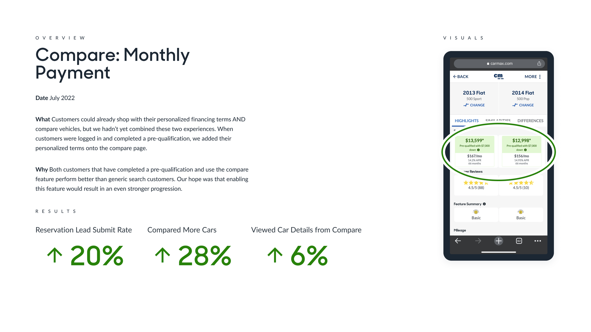
Customers could already shop with personalized financing and use compare, but we'd never combined the experiences. When we added financing terms to the compare page, reservation lead submit rate jumped 20%, compared cars increased 28%, and views to car details from compare rose 6%.
-
This one came directly from customer feedback. Someone wrote: "Be able to filter by negatives...It would be nice to not only say the features you are looking for but the features you definitely don't want."
We built "nofinements"—little red pills for exclusions instead of the blue pills for inclusions. We hid it in advanced search to test cautiously. Only 0.03% of searches used it, but those users converted 60% better than regular filter users and used advanced search twice as much as other options. It became a differentiator for CarMax, even if it was a niche power-user feature.
-
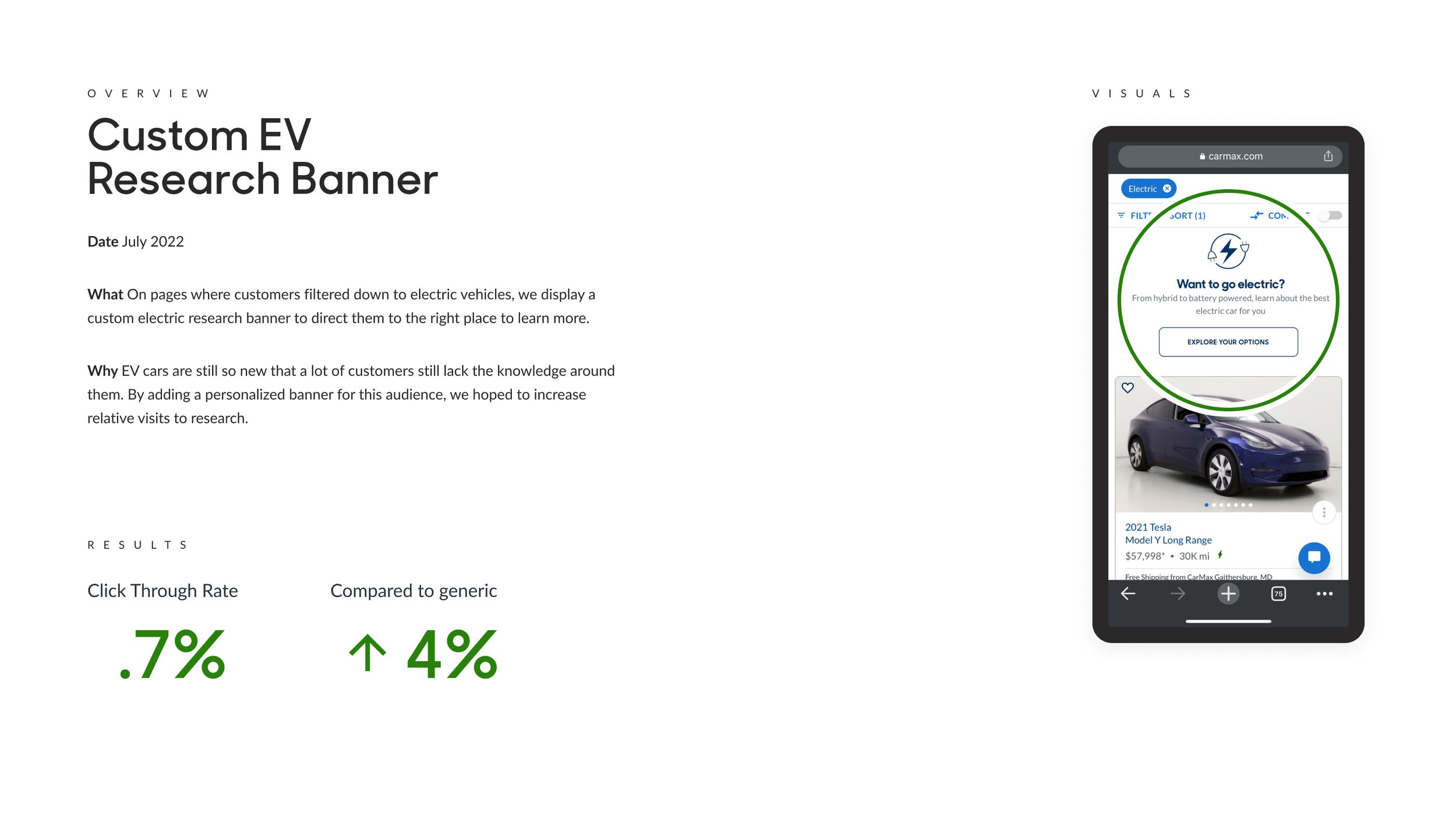
Not every test was a winner. The banners created personalized content blocks that guided customers to relevant research pages based on their search. Click-through rate jumped 54%, but it didn't bring customers back to search or increase progression the way we hoped. Flat results. We learned and moved on.


The Design Approach:
Trust Through Repetition
We operated in CarMax's LEGOS design system, following established patterns to keep the experience cohesive. But the real magic happened in our process.
We whiteboarded constantly. I'd mock up designs in real time during team brainstorming sessions. We'd show concepts to customers as frequently as possible. Everything was validated through qual and quant before shipping.
The team sat together—physically and metaphorically. Our weekly FullStory sessions meant engineers, PM, analyst, QE, and I all watched the same customer struggles unfold. When you watch someone rage-click because they don't understand why their search returned zero results, it creates shared empathy and urgency.
The longer I was on the team, the more I trusted my gut. Some things we knew were right for customers. Testing felt unnecessary. There were "just do it" moments where validation would have slowed us down without adding value. But that confidence only came from years of testing building pattern recognition
What Made It Work
This wasn't a typical product story because it wasn't a typical product timeline. We stayed together as a team for years. That continuity created deep domain knowledge and trust that initiative-based teams never achieve.
The trust mattered. We trusted each other's expertise. We trusted the data. We trusted customers to tell us what they needed. We trusted the iterative process to compound small wins into meaningful impact.
The hard part? Leadership often wanted big splashy redesigns. Stakeholders wanted timelines with clear "before and after" moments. But we held the line, advocating for the slow, patient approach. The nationwide default test took months of conversations with leadership to prove the value. But when the data came in showing $9.2M in annual incremental profit, the patience paid off.
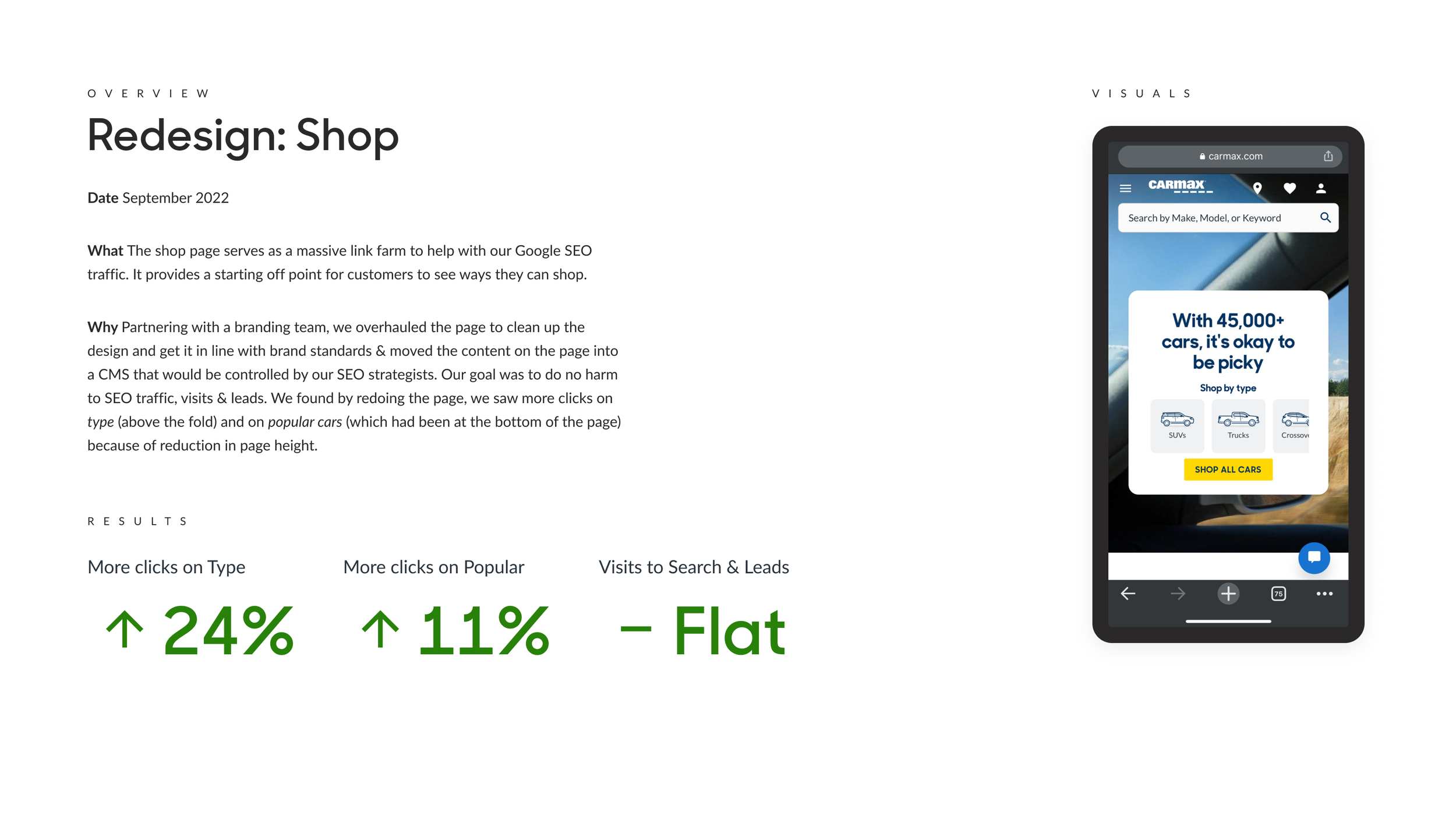
SEO was constantly in the way. We made accommodations for Google that sometimes compromised user experience. We created pages that were essentially link farms for search engines (like the Shop page redesign in September 2022). Balancing human needs with bot optimization required creativity and compromise.
What didn’t work
Not everything tested well. The Custom EV Research Banner (July 2022) had a click-through rate of just 0.7%—four times worse than generic banners. The Low Search Results Unlocks experiment (July 2023) saw only 3% interaction with the pivot tiles, with flat leads and a 5% increase in abandon rate. Some ideas just don't work, and you have to let them go.
Customer feedback could be contradictory. Car enthusiasts wanted granular controls. Novices needed simplicity. Budget shoppers needed transparency about financing. Every solution pleased someone and frustrated someone else. We had to design for the middle while offering power-user escapes.
What I Learned
About users: Car buying is deeply personal. A car reflects identity and life experience. I heard stories of loss—people who'd just totaled their only vehicle and desperately needed reliable transportation. I heard stories of pride—first-time buyers, parents buying their teenager's first car, people treating themselves after a promotion. The stakes felt higher than pixels and conversion rates.
About process: Iterative cycles, when done right, compound into transformation. The search page today is objectively better than it was years ago across every meaningful metric. But there was never a "relaunch." Just steady, patient, evidence-based improvement.
About teams: The trust we built as a team was invaluable. Our actual working dynamic—the weekly rituals, the shared FullStory sessions, the collaborative brainstorming—created psychological safety that enabled better work. When you know your teammates have your back, you take smarter risks.
About myself: After extended time on a sustained team, I learned to trust my instincts more. Not every decision needs a test. Sometimes you just know. But that knowing only comes from doing the hard work of testing first for years.
The Ship Today
Is CarMax's search page the same product I started working on years ago? Yes and no. The purpose remains: help customers find vehicles quickly and efficiently. But every meaningful component has been replaced, refined, or rebuilt based on evidence.
Customers see more cars. They hit dead ends less often. They discover tools—compare, nofinements, nationwide search—that didn't exist or were buried before. Conversion rates are higher. Satisfaction is better. Revenue impact is measurable.
Theseus' ship sailed because every plank was examined, tested, and replaced only when a better option existed. That's what we did. One experiment at a time. One customer insight at a time. One tiny improvement compounding with another. This is what product work looks like when you resist the urge for dramatic redesigns. When you trust the process. When you stay long enough to see small changes become transformational.
The ship still sails. It's just a much better ship now.
The Bottom Line
Through years of sustained, iterative product work and dozens of experiments, we transformed CarMax's search experience without ever doing a "big redesign." Small, evidence-based changes compounded into measurable impact: incremental profit, dramatically reduced zero-search results, and significantly improved customer progression. The lesson? Patience, process, & persistence work.