
C A R M A X
Shopping with your financing terms
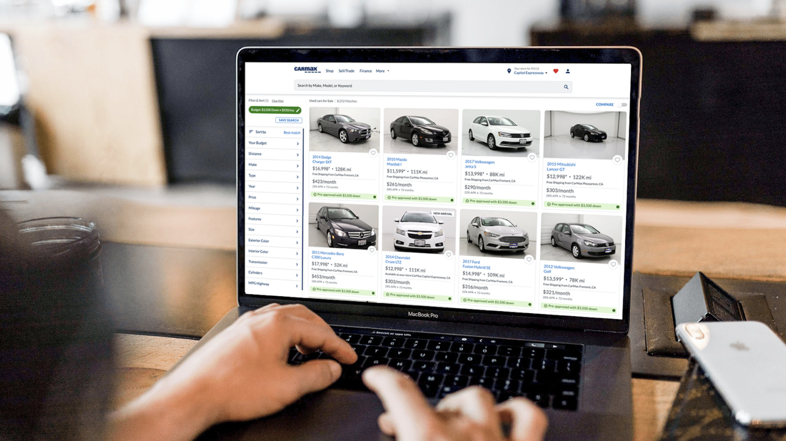
Affectionally known as “SWYFT,” this product empowers customers to use the personal results of their financing pre-approval application to shop all cars within their budget.
The Set Up
For years, CarMax customers could get pre-approved for financing on a specific car or for a total dollar amount. But once they had that approval? They were stuck looking at just that one vehicle or exploring aimlessly guessing at financing numbers with the rest of the available inventory.
The dream was simple: let customers shop with their financing terms across all of CarMax's nationwide inventory. Enter SWYFT—Shopping With Your Finance Terms.
To prove out the value of SWYFT, we did an initial test called ToT or Terms on Tiles. This MVP experiment proved customers wanted a product that would help them shop using financing terms. It did one thing: displayed financing terms on car tiles on one page of search results. That's it. No controls, no filtering, just visibility on a limited set of cars. And that small change led to a 29% increase in hold or transfer leads.
SWYFT on the other hand was all the controls, the entire inventory was "crunched" with a new API instead of small batches of vehicles. And it gave customers power over their budget with filtering and sorting capabilities.
I joined the project in 2020 right as ToT was proving the power financing on search had.
When Finance Meets Search (And Two Engineering Teams Nearly Go to War)
-
This wasn't a typical product team—it was a program team, which at CarMax meant pulling together core capabilities from three different domains: Finance Based Shopping, Search (my team), and Finance Self Service.
The structure was intentional: a product manager, lead engineer, and designer from each core team, plus delivery managers, visual designers, and a small army of front-end, back-end, and QA engineers. We operated under a shared OKR with weekly check-ins and cross-discovery sessions we playfully called "Tailored SWYFT collab" or "Tailored SWYFT disco."
I led design decisions, facilitated weekly discovery sessions across teams, and presented to the larger program in share-outs. On paper, this sounds efficient. In practice? Mixed team culture. My direct team worked beautifully together. But across the financing program, significant trust-building had to happen. Different domains, different priorities, different opinions on what "done" looked like.
-
When I joined, I had search expertise but zero finance knowledge. So I did what any designer would do: I went to school.
I attended the weekly Finance Design Guild—where all designers working in the financing space gathered to share insights, navigate legal requirements, and support each other. Listening to them work through compliance hurdles was critical to my ramp-up. Their encouragement kept me going through the steep learning curve.
I sat down with SMEs, PMs, and designers from other teams to hear their visions for what SWYFT could be. Luckily, my core team's PM had designed the ToT experiment and started his career on a finance-specific team. When I had questions about decisions that predated my involvement, he had answers. That partnership was invaluable.
I also watched FullStory sessions of customers inside the ToT experiment to understand how their search behavior changed when they saw financing terms. What surprised me most? How little customers used the financing filters in their shopping journey. They'd see their terms, feel informed, but rarely adjusted them. That insight shaped everything.
While I ramped up and ran initial discovery, engineers were building the API that could support customer expectations at scale—moving from small batch "crunching" to processing the entire inventory in real-time.
-
After joint discovery sessions and FullStory observations, the problems with ToT became clear:
No control. Whatever came from your pre-approval application was locked in forever. You couldn't adjust your monthly payment or down payment to explore options.
Shallow budget guidance. The "green flags" on pre-approved cars did all the heavy lifting to signal something was different. Customers repeatedly told us they didn't fully understand that their search experience was personalized.
Pattern collision. Those green flags were colliding with existing visual patterns inside the experiment, creating confusion.
One-way street. You could only enter this experience from a single link on "The Station" (the page where pre-approval results appeared). If you navigated away, good luck finding your way back.
These weren't just usability issues—they were foundational problems that would prevent SWYFT from scaling.
How would you describe this to a friend?
“I would say, this is a no hassle car buying website.
All you need to know, all your numbers are right here. It’s already set up for you.”
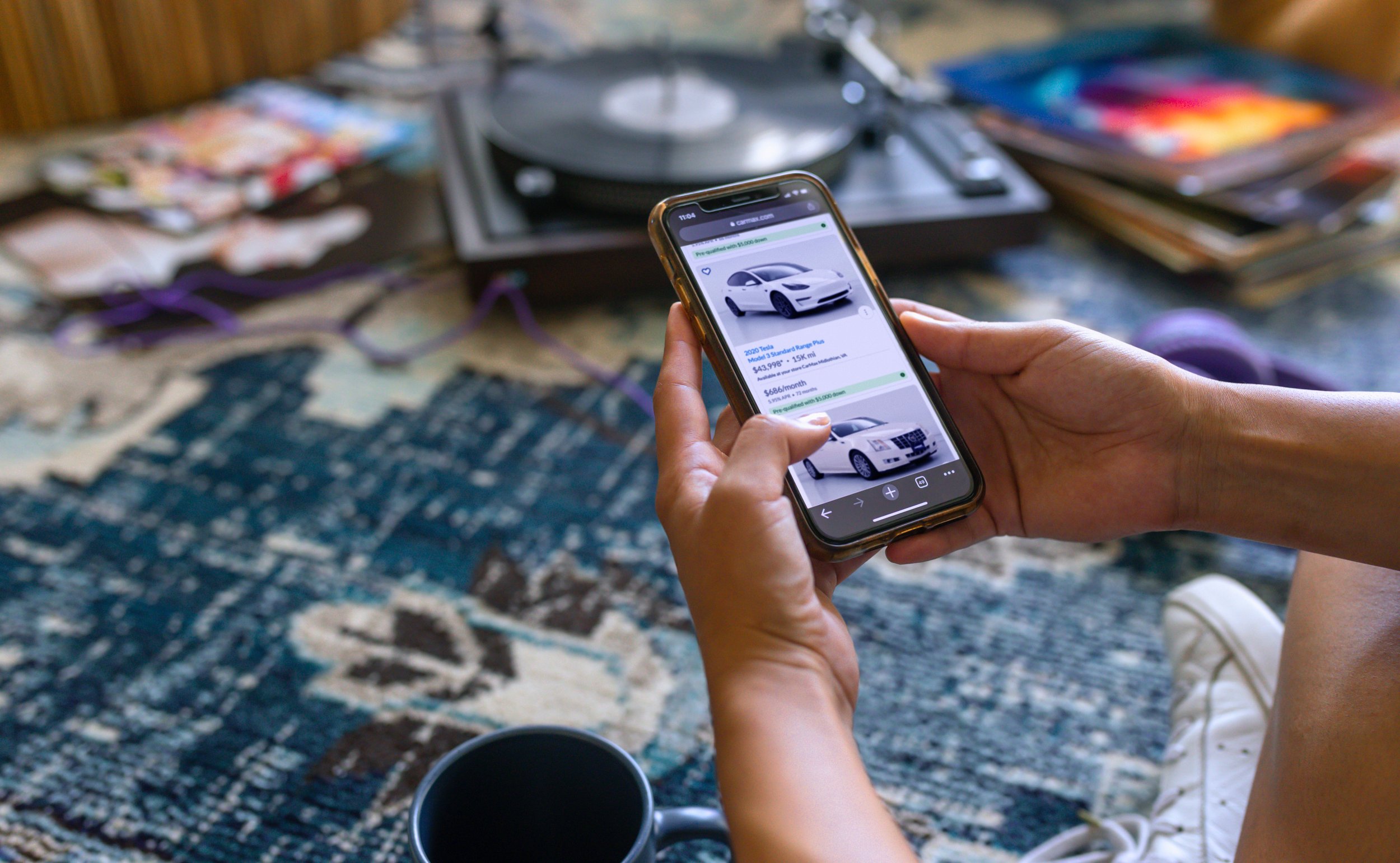
Tiles: The Quick Win That Became a Legal Negotiation

I knew I could improve the customer experience fast by tackling the tile design. Any updates to tiles in ToT would carry forward into SWYFT, so this was high-leverage work.
I partnered with Hank (the original ToT designer) and a visual designer. We explored a lot of options, eventually settling on a stoplight color system: green for pre-approved, yellow for conditionally approved (additional down payment needed), red for not approved, and gray for unavailable financing information.
The redesign gave us more real estate to communicate terms—critical when monthly payment ranges or APRs varied widely. We increased the clickable surface area; the entire colored bar became a touch target instead of a tiny info icon ⓘ. At a glance, customers could scan the search page and interpret their options without diving into fine print.
Tile Details

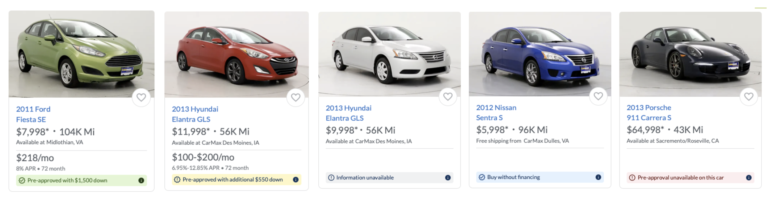
We also had to account for unhappy paths: what if the SWYFT API breaks down and decisions won't render? What if a customer's down payment is higher than the price of the car, meaning they don't need financing? What if they're declined for a specific vehicle?
These edge cases required extensive back-and-forth with copywriters and legal to nail appropriate language. Even weeks before launch, we were finalizing the "buy without financing" edge case—when customers came in with down payments exceeding vehicle prices.
But here's where it got messy.
-
Team morale dipped hard during this phase. Two things collided at once:
Legal requirements. The legal team insisted that terms and conditions copy had to appear next to every single customer's monthly pricing. These were long, repetitive disclosures. We compromised by adding info icons on car tiles that displayed terms on click, but it felt like a defeat. We wanted clean, scannable tiles. Legal wanted compliance. We met somewhere unsatisfying in the middle.
Google Core Web Vitals. Google started heavily prioritizing Cumulative Layout Shift (CLS) metrics. When we added monthly payment information to car tiles, each tile increased in height, which tanked our CLS scores. Poor CLS meant worse SEO rankings, which was unacceptable for a company whose search traffic was a massive acquisition channel.
We had to run extensive testing to ensure our SEO metrics felt no impact. Engineers were stressed. Designers were stressed. The legal back-and-forth felt endless.
One of my developers, buried deep in the weeds on this, created a custom loading spinner. It was a small, playful touch—a spinning car tire. Including it in the flow gave him joy and boosted team energy at a critical moment. Sometimes morale comes from the smallest acts of creative ownership.
-
Here's the part that doesn't make it into polished case studies: two different sets of engineers were competing over how the backend work would be structured.
Different approaches, different philosophies, different egos. Meetings became tense negotiations. Engineering leadership took far too long to step in and provide direction. As the designer, I was caught in the middle—trying to design an experience while the technical foundation underneath shifted constantly.
It was the most frustrating moment of the project. Not a design challenge, but a leadership vacuum that created churn and uncertainty. When engineering leadership finally intervened and made decisions, we moved forward fast. But those lost weeks cost us momentum.
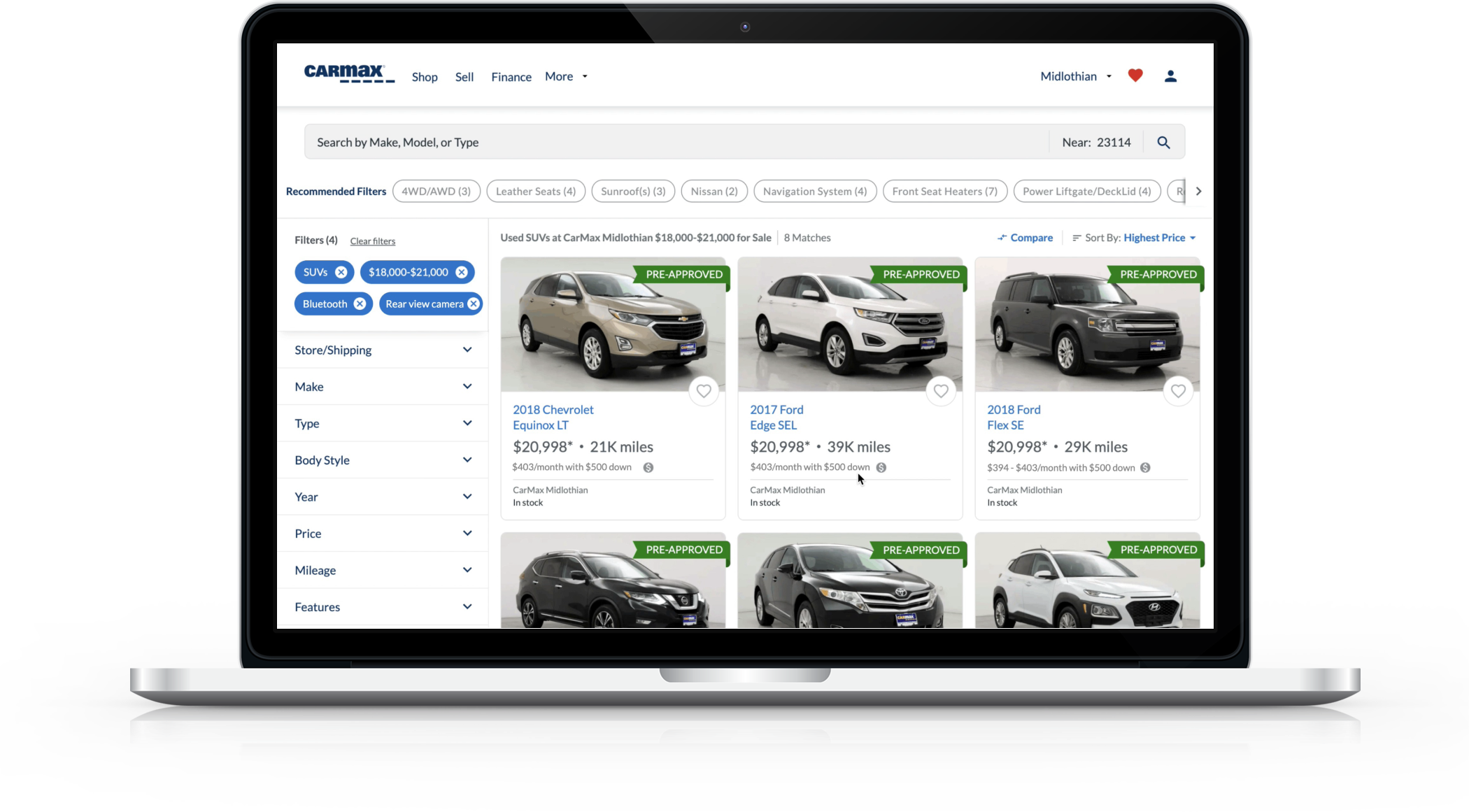
The Budget Filter: Where Search Expertise Saved the Day
The budget filter became the heart of SWYFT, and this is where my search skills truly mattered.
Customers already had access to a calculator filter in search, so there were existing patterns and stakeholder assumptions about what this should look like and how it should behave. A few "decisions" had been made before I joined about the design and behavior.
To sort through competing visions, I led a workshop. We laid out SWYFT's technical capabilities, then had different folks sketch how they thought the budget area should work. We talked deeply through each person's decisions and assumptions to uncover the real job to be done.
I took the sketches away, distilled "must haves" from "nice to haves," and simplified for the customer.


The result was minimal. I stripped layers to focus on two key elements: Down Payment and Monthly Budget. That's it.
I broke normal search filter patterns to account for this special use case. The budget pill was green (tying into the tile color system) and locked into place unlike other filters. When you added car makes or models, the budget stayed front and center. Based on customer behavior research, clicking the pill automatically opened the budget filter for easy editing.
Removing the budget pill was intentionally difficult. Unlike other filters where you just click an X, I buried the removal inside the budget filter area. Why? Because removing your budget fundamentally changes the experience—you start seeing cars you're not pre-approved for. That needed friction.
When customers attempted to remove it, we warned them with an illustration and clear message: "If you remove your budget, you will start seeing cars that require more money down or that you are not approved for."
The Challenges That Made Me Better
User Testing
User testing is uniquely hard. Customers struggle to envision prototypes when the financing terms don't match their real situation exactly. User testing got us directional insights and gut reactions, but real discovery would only happen once it was live with actual customer data.

Legal
Legal is its own design constraint. Language, supporting copy, managing expectations—these weren't nice-to-haves, they were requirements. I'm still learning how to get asynchronous approval on updates and how to separate true legal feedback from opinionated critique dressed up as compliance concerns.

Tech
Technology creates invisible constraints. The "crunching" problem shaped every interaction. I designed around performance limitations I couldn't see or control, hiding latency behind smart sequencing and progressive disclosure.
Teams
Cross-program coordination requires different muscles. My direct team worked beautifully. Building trust across the finance program—with different stakeholders, competing priorities, and engineering teams nearly at war—stretched my leadership capacity in ways a single-team project never would.
The Results
After tweaks & testing we defined the control experience to default customers with their budget filter off, so customers could see all cars in inventory right away, including ones outside their budget. Through discovery & observation we learned that if we showed customers all the cars we had available, then they would back into a budget that was more in line with the current inventory and market.

Following the release of pre-qualification, CarMax began a marketing campaign to promote the ability to shop with your financing terms. Check out one of my favorites with Steph Curry and Candace Parker.

The Bottom Line
SWYFT took pre-approval from a static endpoint into a dynamic shopping tool. We reduced repeat credit applications by nearly 17%, helped 14% more conditioned customers find affordable cars, and laid the foundation for finance to become a true integrated capability across CarMax.
But more than the metrics, SWYFT taught me to trust my design instincts at a leadership level. It was messy—competing engineering visions, legal negotiations, performance compromises, a design partner leaving mid-project. Through that mess, I learned I could lead across programs, build consensus among stakeholders with different agendas, and design systems that genuinely help people make better financial decisions during one of the most stressful purchases of their lives. I am proud to have helped build something that served to help people shop with confidence, knowing what they can actually afford.