
C A R M A X
From Drawer to Dish:
Redesigning the Store’s Title Details Page
How one designer (me!), a hungry product team, and 260+ stores transformed a cluttered drawer into a complete meal, with all the right ingredients in all the right places.
Before & After
Drawer
Full Page
Picture this: You're a CarMax store associate trying to figure out what's happening with a vehicle title. You open what should be a complete view of the title's story, but instead you get... a drawer.
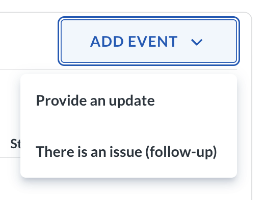
And Inside that drawer? A limited bit of information with a rough view into the history of what has been happening with that car & title. Yes, there were vehicle details here and a customer name there, but the full picture history? Nope. In fact one could only see the last transfer of the car, even if the car had moved through 12 stores. The notes were long, confusing, and mostly useless. And when you wanted to record what you'd actually done to track down a title? Your only options were "provide an update" or "there's a problem."
Seventy percent of the time, associates clicked "there's a problem," answered "no one" when prompted by the next question, "who did you communicate with?" Ultimately leaving a vague note that told CarMax's business almost nothing about what was actually happening or what work had actual been done.
The result? Stores and home office couldn't align on what was going on. Leadership couldn't identify why titles weren't complete. And every day a title sat incomplete cost CarMax about $18 in lost revenue per car, No-Title Days that added up fast across hundreds of vehicles.
This is the story of how we took that title drawer & turned it into a full, complete dish.
The Problem: Too Many Ingredients, Not Enough Space
Role: Designer | Title And Central Operations (🌮 TACO) team
Team Structure: Classic product team—Product Manager, front and back-end engineers, analyst, field lead, and me!
Timeline: ~ 12 months from start to finish
(while working on other projects simultaneously)
Over 40 sessions of discovery & iteration
1 month for the initial page redesign
8 weeks specifically on action results (the hardest, work to improve the experience)
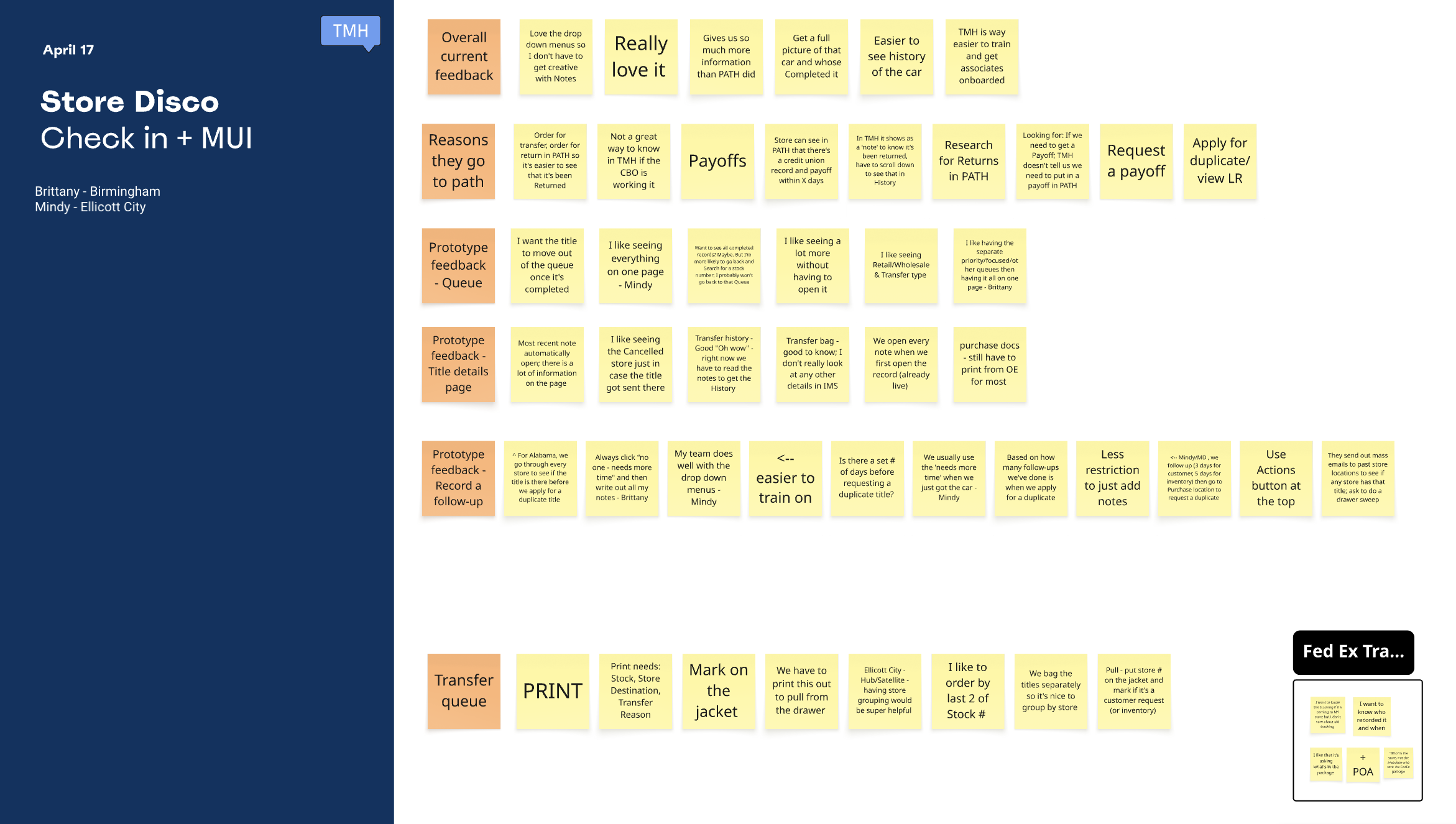
The Research: Seven Stores, Hundreds of Feedback Comments, & a Big Realization
I started by reading everything. We had over 200 Title Details Page-specific comments from associates, with new ones rolling in daily. I organized them in Miro boards, looking for patterns: What kept coming up? What was working? What was broken?
Then we hit the road.
I visited stores, of differing business models, across California, Virginia, & Florida, shadowing and interviewing associates. Over four months, I ran weekly remote discovery sessions with stores (three at a time) showing prototypes and gathering feedback. In total, about 50–60 store associates and their managers contributed to the research.
The "Aha" Moment
Early on, I started designing two very different systems for recording work: one for stores, one for home office. Different flows. Different language. Different everything.
But as we dug deeper into the research, we realized: this was making things harder, not easier. Trying to customize for the different users in the same system was going to be a problem. If stores and home office were using completely different systems to record similar types of actions, how would they ever understand each other? And worse, how would leadership get a clear picture of what was happening with titles?
So I pivoted: simplify & align.
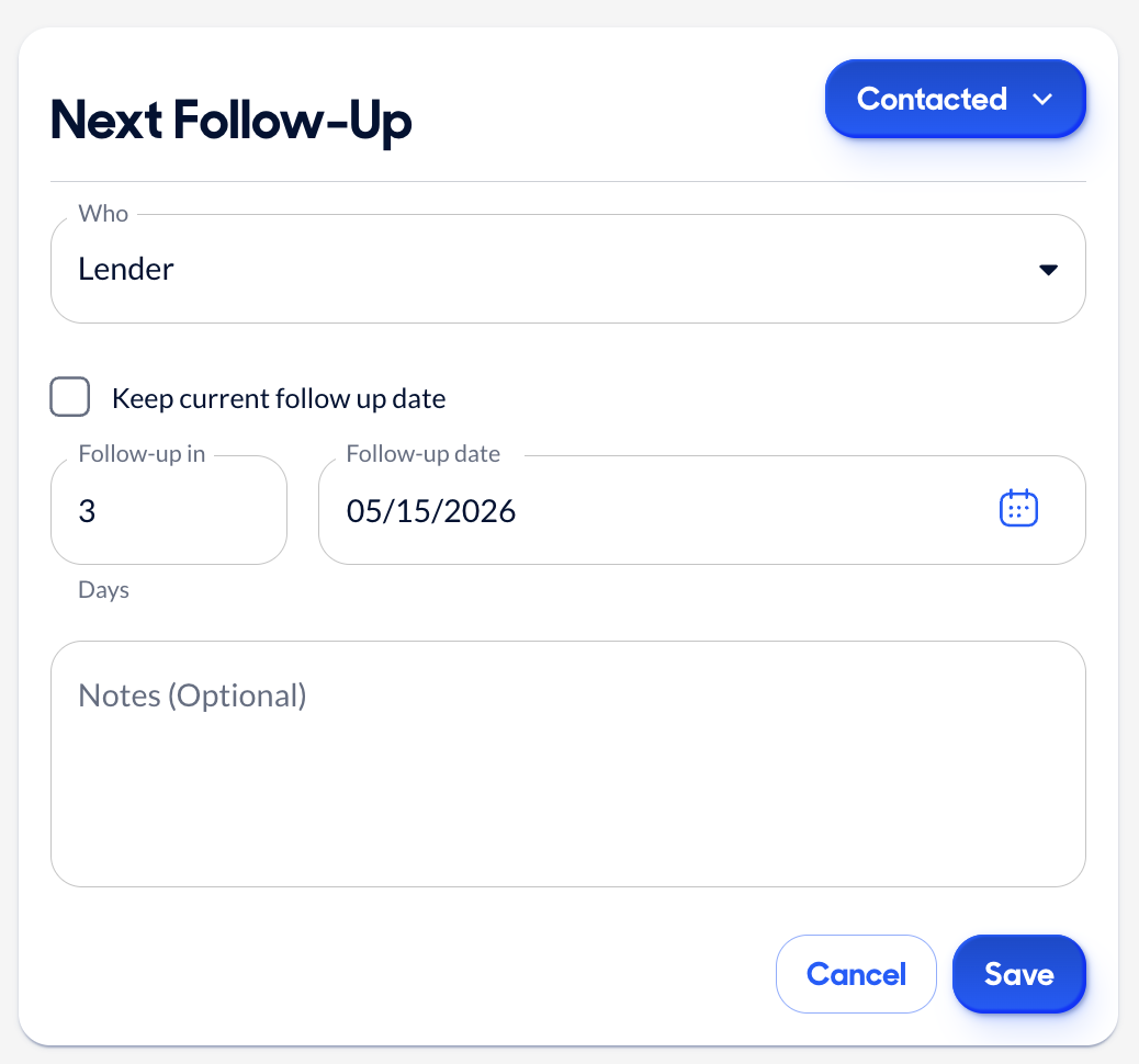
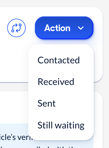
I built one unified action recording system with the same starting categories for everyone: Contacted, Received, Sent, Still Waiting. I did include some extra details for the home office, but the foundational structure was shared between the two customers.
This was a huge departure from the original direction which operated much under the assumption that the jobs to be done by the two customers using the page were vastly different. But it resulted in a simpler, more structured format that everyone could understand. Not to mention one flow for the product team to maintain instead of two.
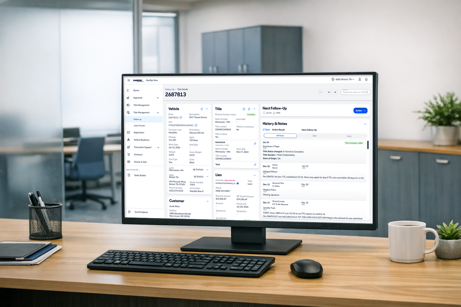
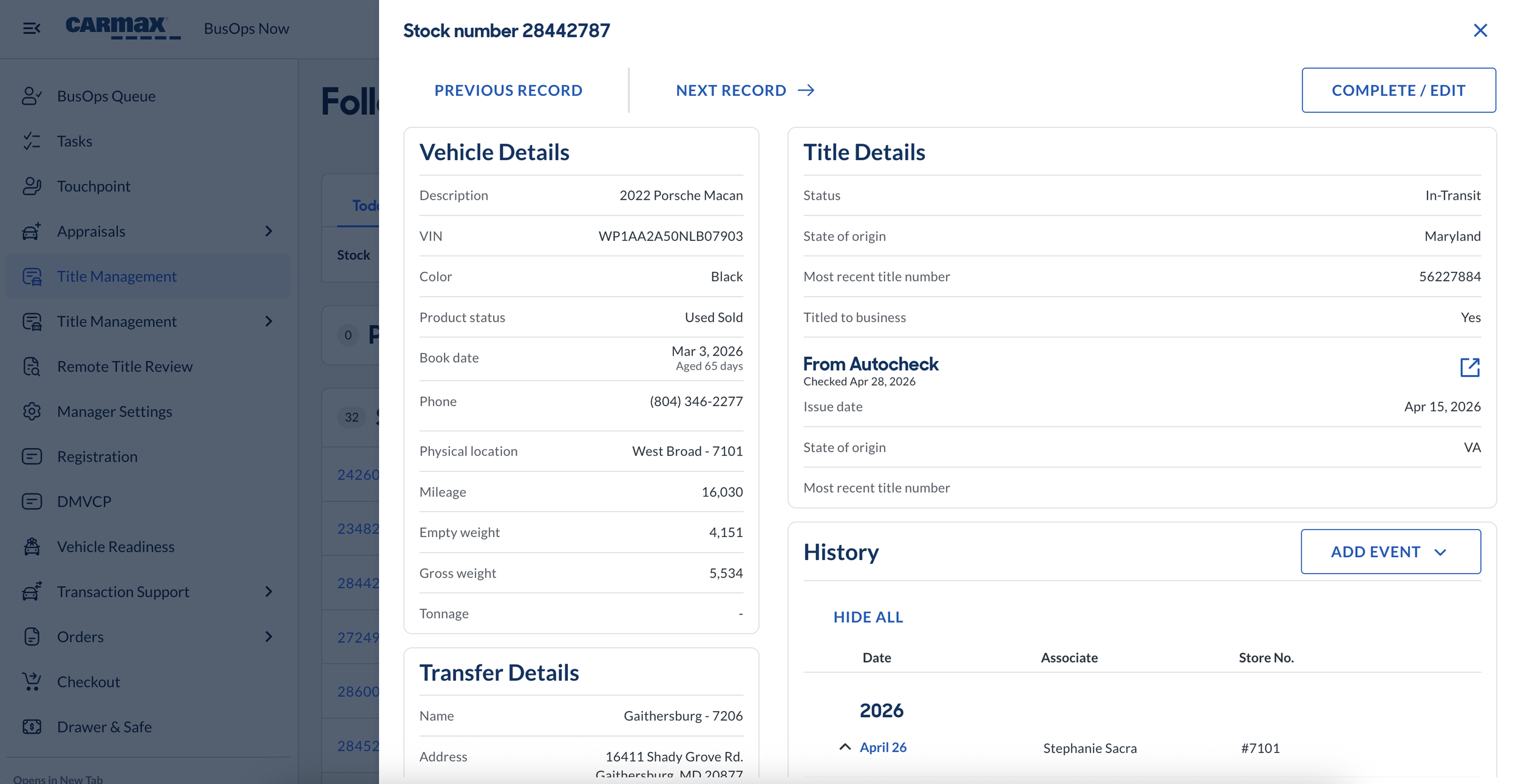
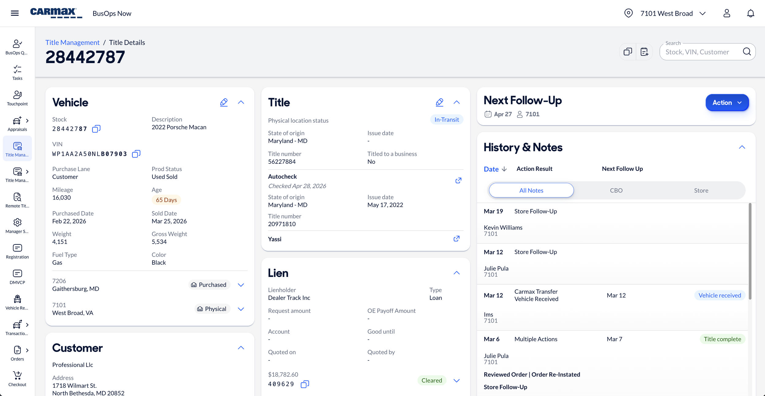
What We Built: A Full Page with All the Right Ingredients
The first and most obvious change: we gave the title details page room to breathe.
The old page opened as a drawer—a sidebar that slid out with a URL structure that didn't use the vehicle's stock number. Want to share a link with a colleague? Good luck. The link wouldn't open anything useful because the page wasn't actually a page.
The new page? A full, responsive page with real-time updating and a clean URL structure based on known stock numbers. Every piece of information lives in one place, accessible and shareable.
Highlights
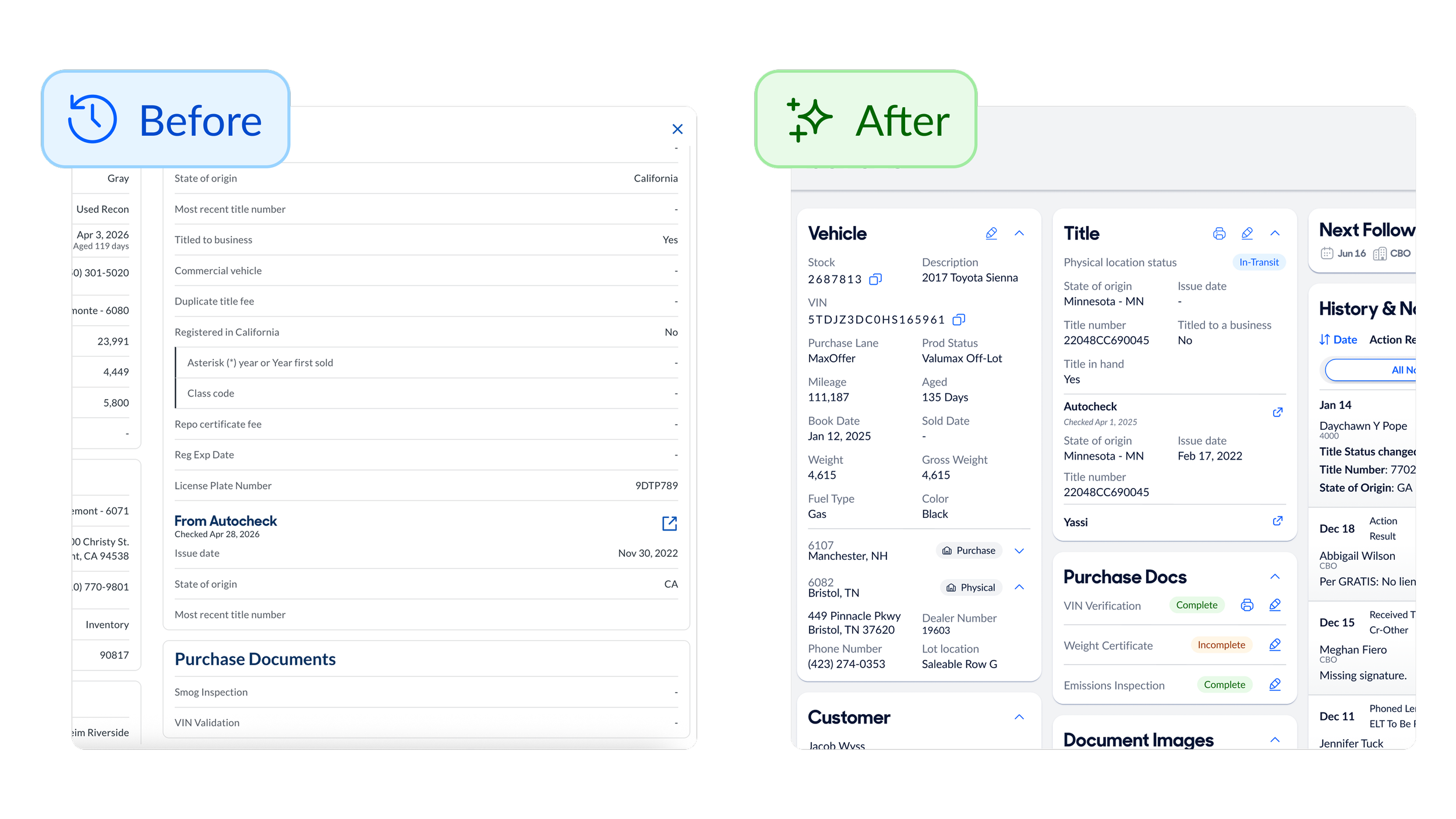
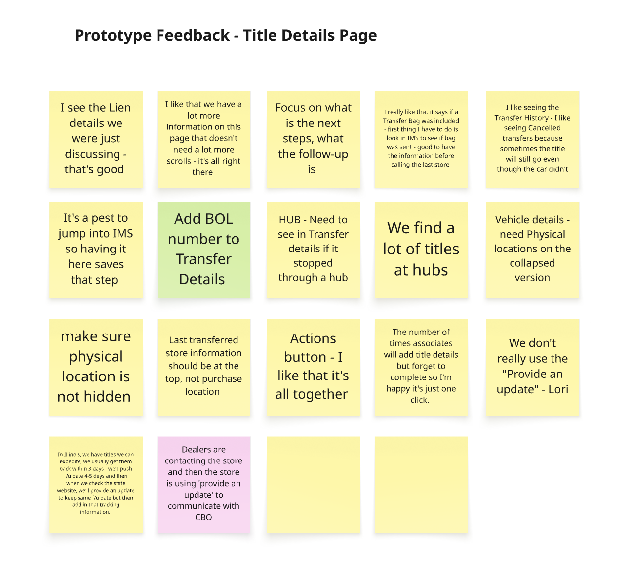
Purchase Docs: Clear Status, Easy to Find In the old page, purchase documents were buried below the fold with no clear indication of whether they were complete or incomplete. Associates had to scroll, squint, and guess. The new page surfaces purchase docs clearly with color-coded status indicators showing exactly what's required and what's missing.
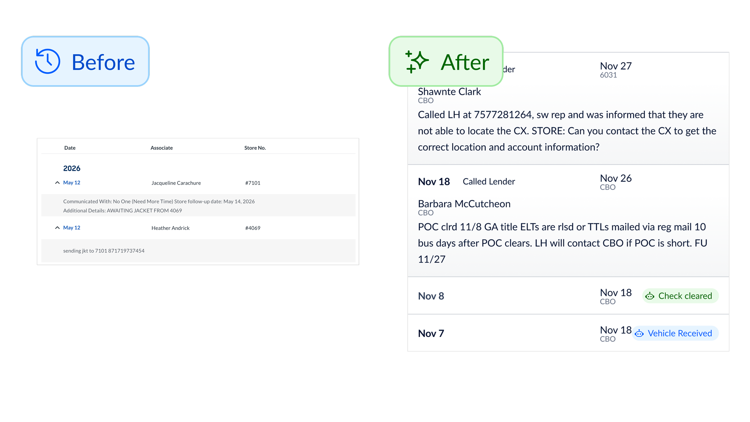
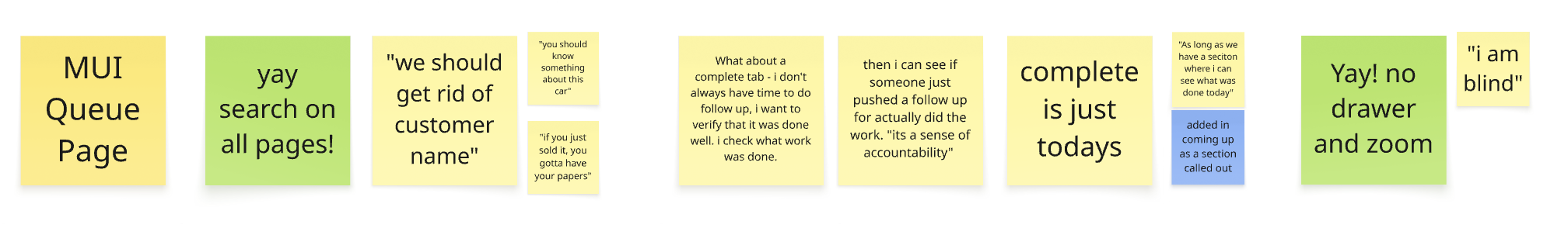
History & Notes: Signal Over Noise The old history section was a mess. Updates from robots, updates from associates, updates from home office—all jumbled together in one long, confusing timeline. Associates couldn't tell who did what or when the next action was due. The new page cleans this up with clear structure: Date of event, summary of event, next follow-up date, responsible party (name & location) We also added filtering so store associates could view just store notes, and home office could view just home office notes—reducing the noise and surfacing what matters most to each user.
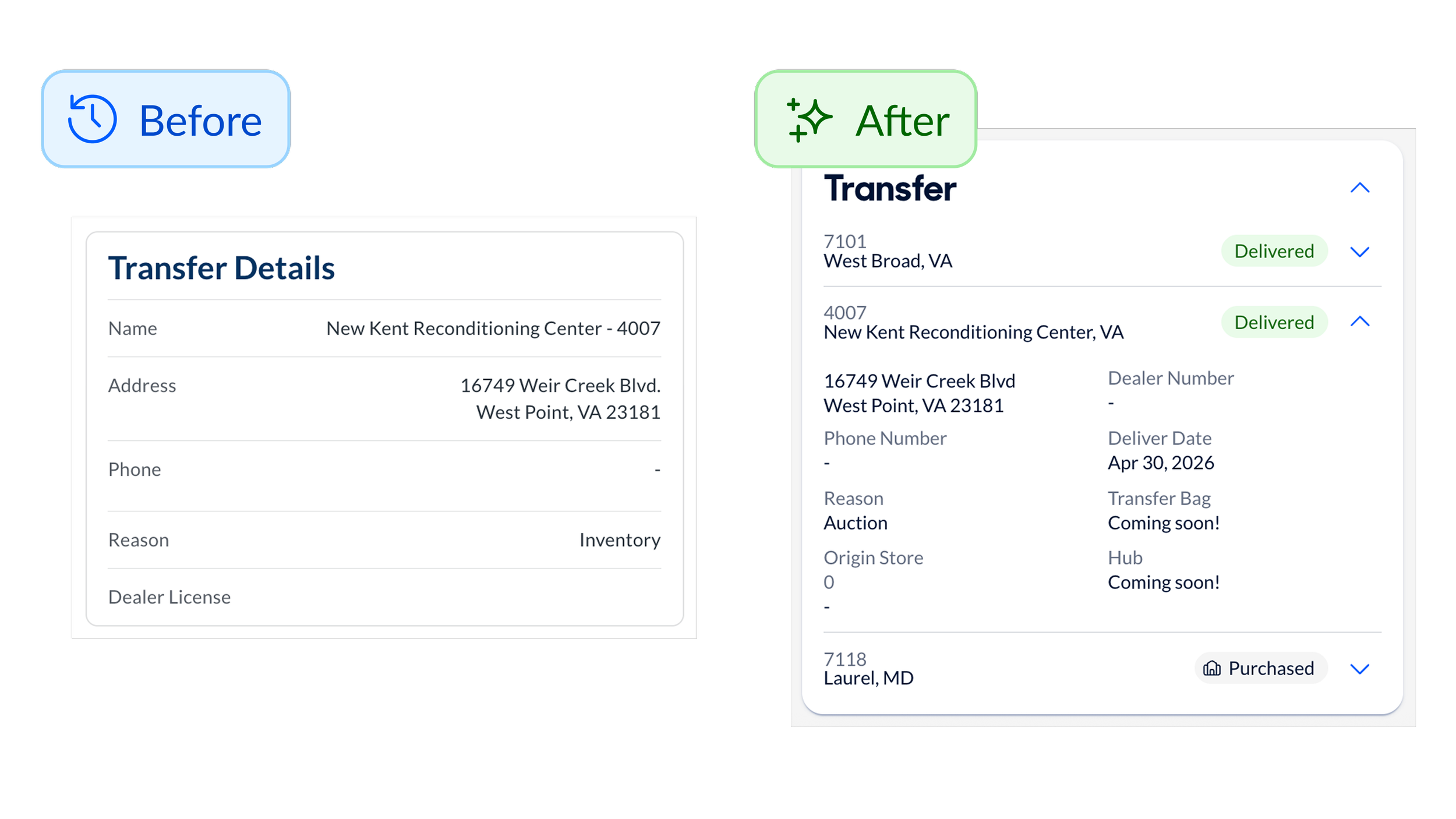
All the transfers, in one place The new page shows a full transfer history rollup highlighting every store the car had moved through—not just the last transfer. Before, if a car had moved through eight stores and the title was left at store number three, the current store had no visibility into that history. They'd have to dig through messy notes hoping someone had mentioned it. Now? It's all right there. One associate called the transfer rollup section "a game changer" for tracking down missing titles.
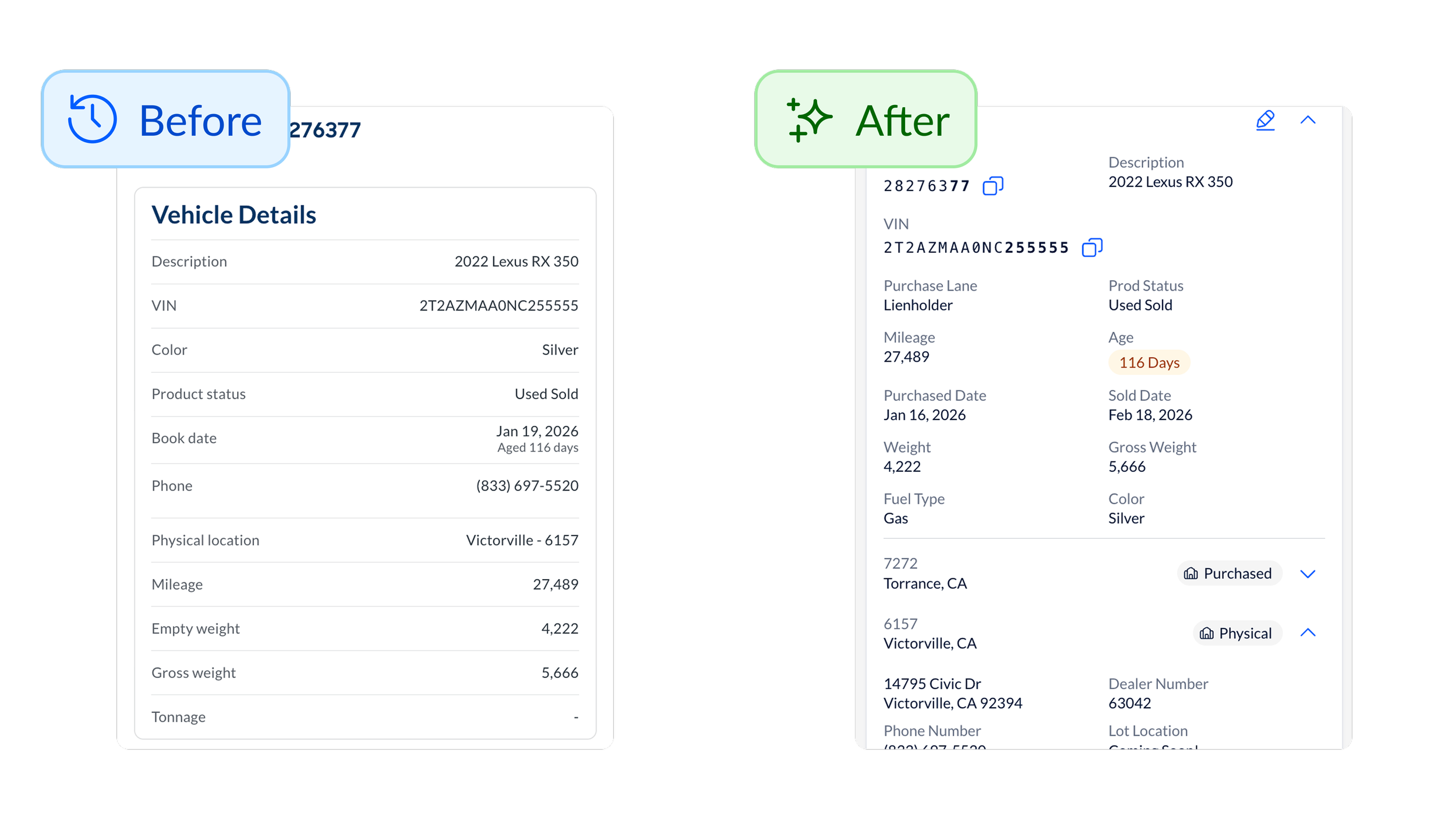
New page, new data The old page was missing critical information that forced associates to hunt across multiple systems. The new page consolidates everything: Physical vehicle location on the lot (in case the title was left in the car), Dealer numbers for every previous store (so associates could quickly call the right business office), Direct links to AutoCheck and YASSI (third party systems for checking title details), Check numbers and payment status for outstanding liens and FedEx tracking information.
The Big Win: Action Results
This is where the real transformation happened.
The store’s old system gave associates only two options when recording work:
Provide an update (basically just a note that didn’t set a follow-up date in the future)
There's a problem (which immediately followed up with the question "who did you communicate with?" but DID allow a follow-up date)
These options missed the mark. Most of the time, associates hadn't communicated with anyone but did need to leave a future follow-up date. So this left a gap in the “there’s a problem” category. Most of the time, they were just...waiting (on another store or the mail to arrive). If they'd sent a document or received part of a title packet, they were out of luck with good options for recording the history. The system forced them to say "no one" and leave a vague note.
These actions resulted in 70% of all follow-ups said "communicated with no one" and provided almost no insight into what was actually happening with the title.
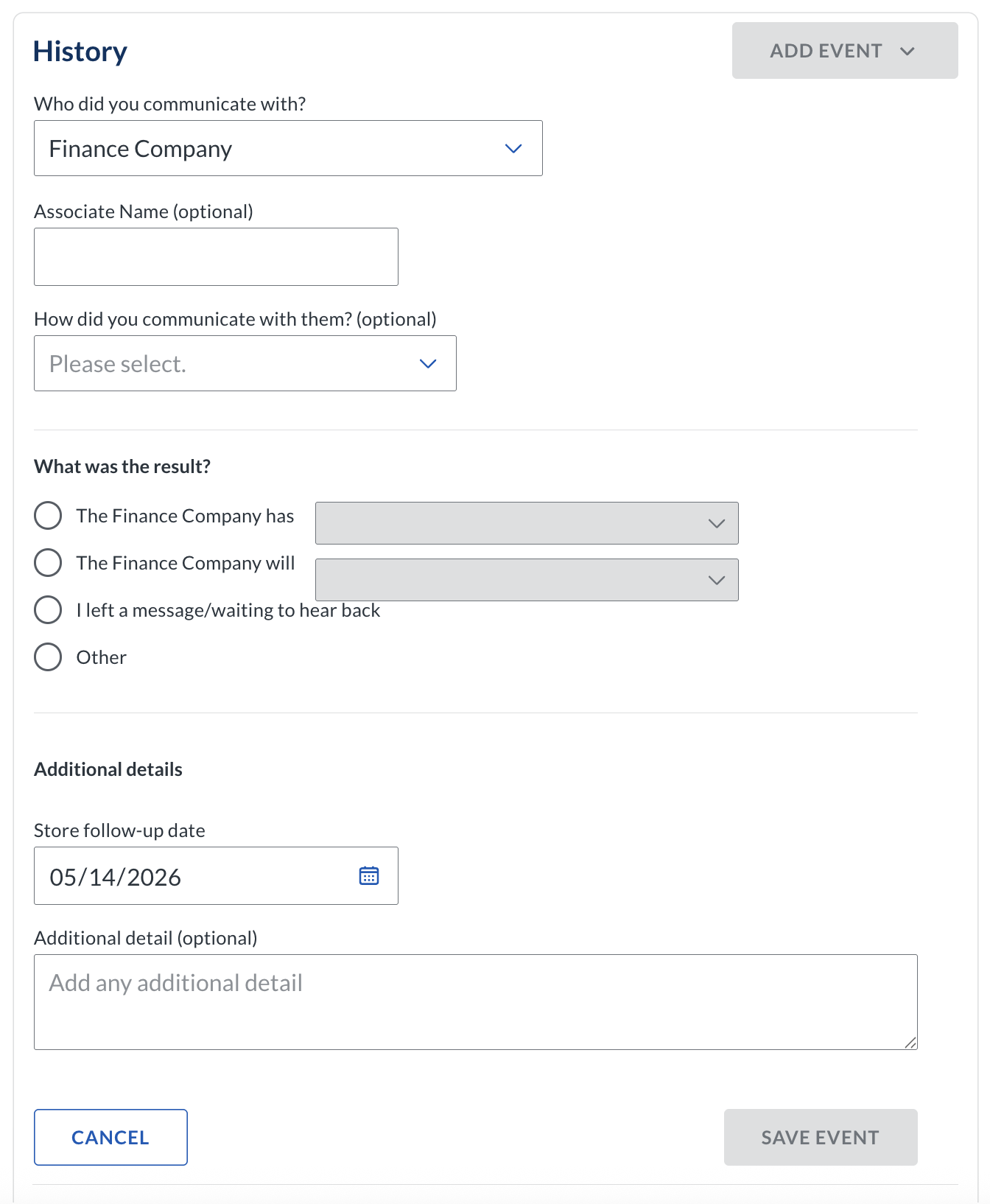
So, we redesigned the Action Results into a structured system that captures what actually happened on a title.
The Four Core Actions
After analyzing open notes, running card sorting exercises with users, and testing iterations with stakeholders, we landed on four primary categories:
Contacted You reached out to someone (a lender, a dealer, or store)
Received Something physical arrived (the title, jacket, or document)
Sent You sent something physical (a title to another store with tracking)
Still Waiting - You're waiting on something specific and there isn’t anything for you to do (Mail to arrive or duplicate title processing)
We tried friendlier early language like "Something happened," or "I need something," but it confused people. Single-word actions landed better. They were clear. They pointed toward business insights. And they worked for both stores and home office.
Customer Feedback
"It feels very different. But it's like we were using the Middle School [version] and now we're using College [version]. It feels more adult like"”
— Associate, Virginia“I love that we can relinquish all the stuff we're used to from [the old tool]”
— Associate, California“I get a full picture of that car and whose worked it…It is way easier to train and get associates onboarded”
— Associate Manager, Maryland Looking forward & back
-
I wish we'd focused on the page redesign first, and then tackled action results as a separate project.
We combined them out of necessity—development was delayed by other projects, and we had to roll everything together. But this meant the research we'd done on action results was nearly 9 months old by the time we launched. It was hard to remember early discovery details. It was hard to keep the team aligned on the "why" behind decisions made so long ago.
If I could do it again, I'd push for phased releases: get the page out instead of the drawer, add in the full transfer rollup, then sprinkle in data improvements. I’d let associates get comfortable.
Then introduce the action results system.Features I Wish We'd Prioritized Sooner
The two most-requested features from progressive discovery were:
Document upload (so associates could attach PDFs and images of titles)
FedEx tracking (so they could track shipped titles in real time)
Both were easy designs. But because they didn't exist in the old system, we held them back to focus on reaching feature parity first.
In hindsight? I wish we'd improved their lives instead of just matching what they already had. Those two features would've been immediate, tangible wins that showed we were listening—and that we cared about making their work easier, not just migrating them to a new design system.
-
This case study isn't about flashy consumer features or viral product launches. It's about the unglamorous, essential work of making internal tools actually work for the people who use them every day.
Store associates don't choose whether to use the Title Details Page. They have to. It's required for their job. So when the tool is clunky, incomplete, or confusing, they suffer—and so does the business.
By transforming a cramped drawer into a complete, well-organized page, we didn't just improve aesthetics. We:
Reduced cognitive load
Eliminated hidden work
Created alignment between stores and home office
Gave leadership visibility into title delays
Saved millions in No-Title Days
And maybe most importantly, we showed store associates that their feedback matters. That we're listening. That we care about making their work easier.
The work I'm most proud of is not the perfect pixels or the clever interactions, but the real, measurable impact on people's daily lives.
-
A few ingredients made this project successful:
1. Direct access to users. Weekly calls with stores. In-person visits. FullStory videos showing real pain points. We weren't designing in a vacuum, we were designing with the people who'd use the tool.
2. A lean, empowered team. One designer, one PM, one architect, one lead engineer, four engineers. No bureaucracy. Just clear ownership and fast iteration.
3. Willingness to pivot. When we realized two separate systems would create more problems than they'd solve, we changed course. That flexibility, backed by research, made all the difference.
4. Phased thinking. Even though we didn't execute perfectly on phasing, thinking in phases helped us prioritize. What's the MVP? What can wait? What needs to launch together?
5. Taco-themed team vibes. Okay, this one's less tangible, but it mattered. TACO leaned into the theme. We had fun. We stayed aligned. And that energy showed up in how we worked together and communicated with stakeholders.
-
The Title Details Page isn't done. It's never done. That's the nature of product work—especially on tools people use every day.
Next up:
Refining a Request feature based on early feedback
Adding document upload to attach title images
Implementing FedEx tracking
At the end of the day, this isn't just about building a better page. It's about building a better experience that respects associates' time, values their feedback, and makes their work easier.
One ingredient at a time. One taco at a time.